
My brand brief and checkpoints for the company can be found here.

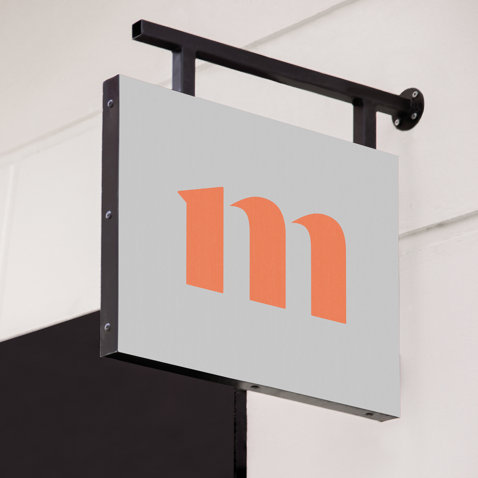
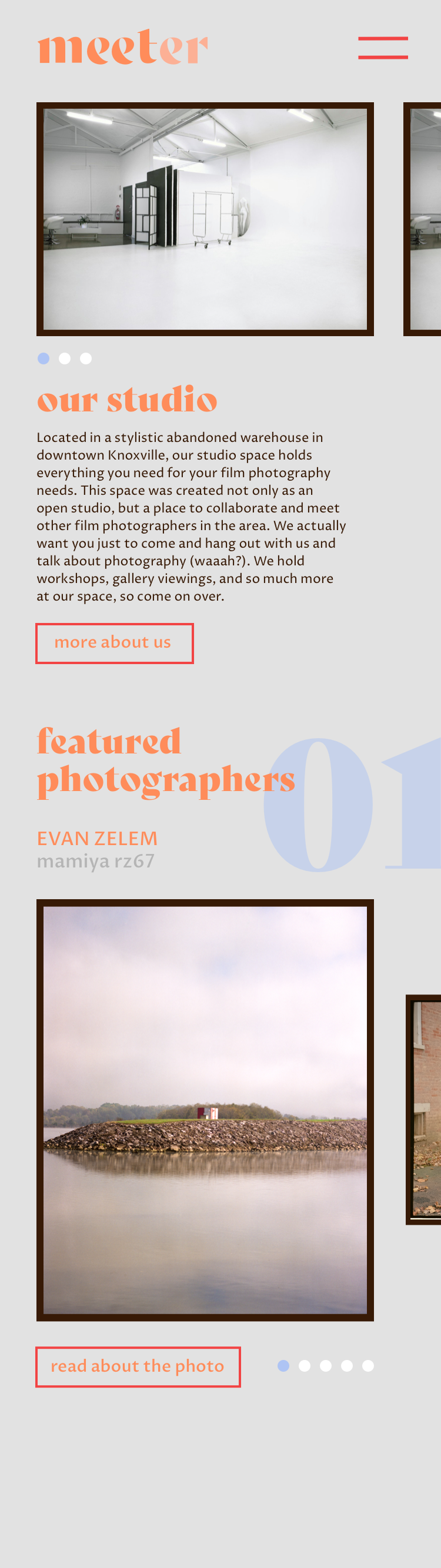
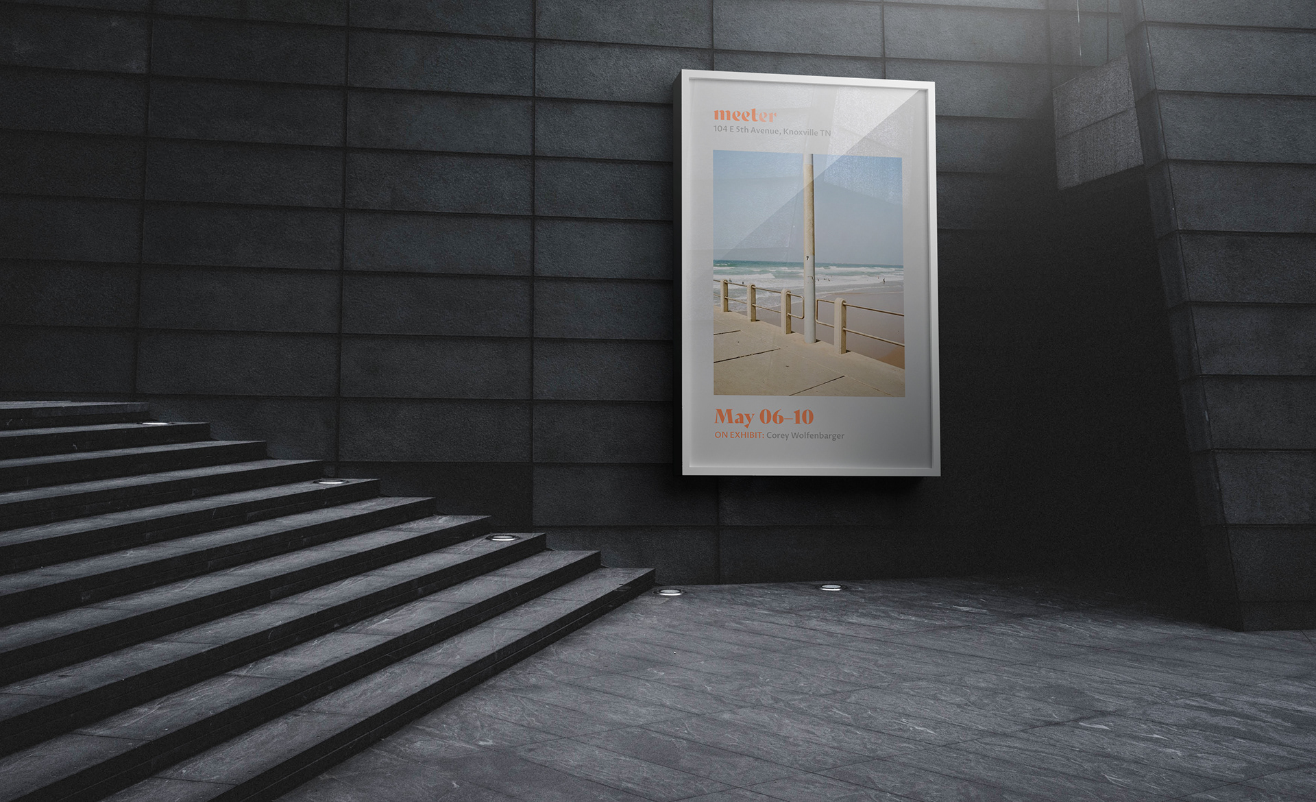
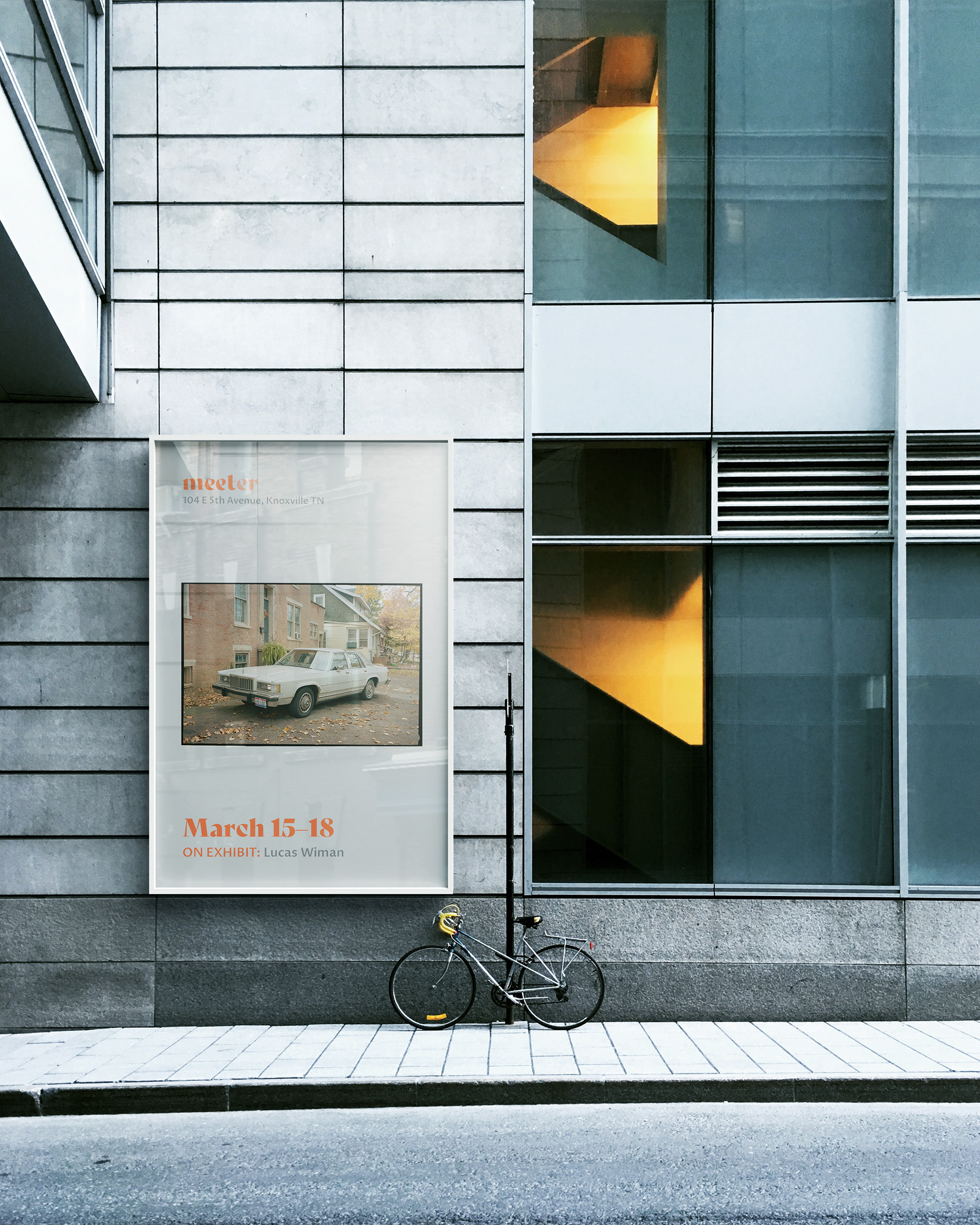
The mark was created to resemble the modern era of film photography using the base typeface of Bely Display, while also using a color palette that was inspired by film negatives. The mark needed to be welcoming and unique, but keep the subtle geometric shapes that film cameras so often use.