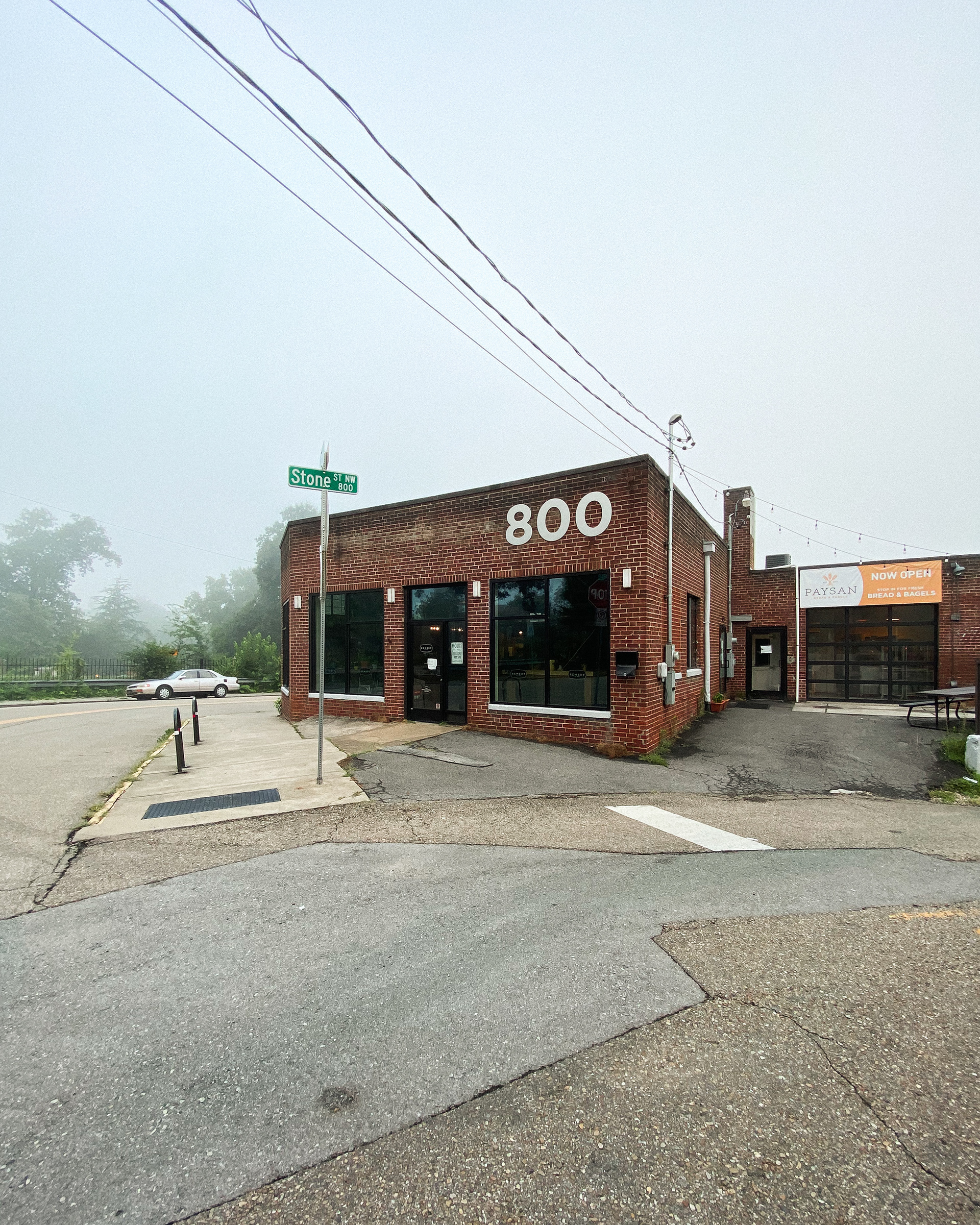
Hayden and I knew exactly what direction we wanted to go in since we had both thoughts about it for a while. Remedy (in recent years) started to focus on rotating roasters and highlighting roasters that Knoxville hadn't seen or heard of. This was one of the things that made them stand out, as well as the atmosphere (having close to 100 plants in the shop really does it), the people working there, and the care and respect they have for coffee and the industry. But one of the things that we wanted to use to their advantage, was the location.
Right next to Remedy is the historic Old Gray Cemetery. You'd be surprised how nice it is to grab a great cup of coffee and walk through a beautiful cemetery. Hayden and I thought creating branding that reflected the cemetery would help establish Remedy's location since it is so unique. We had to be careful about this though because the minute you introduce skulls, spider webs, and anything "spooky" people immediately think of Halloween.
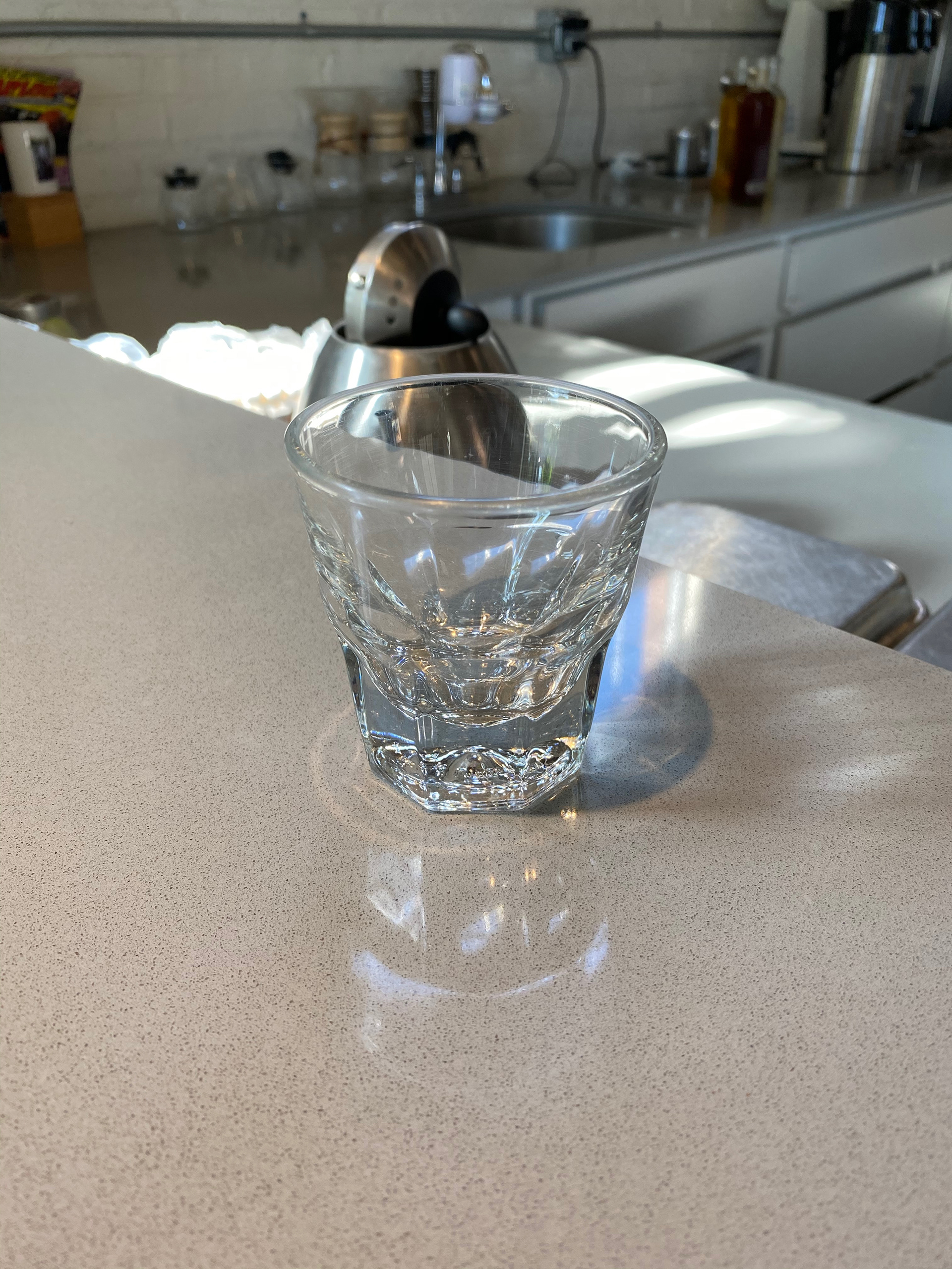
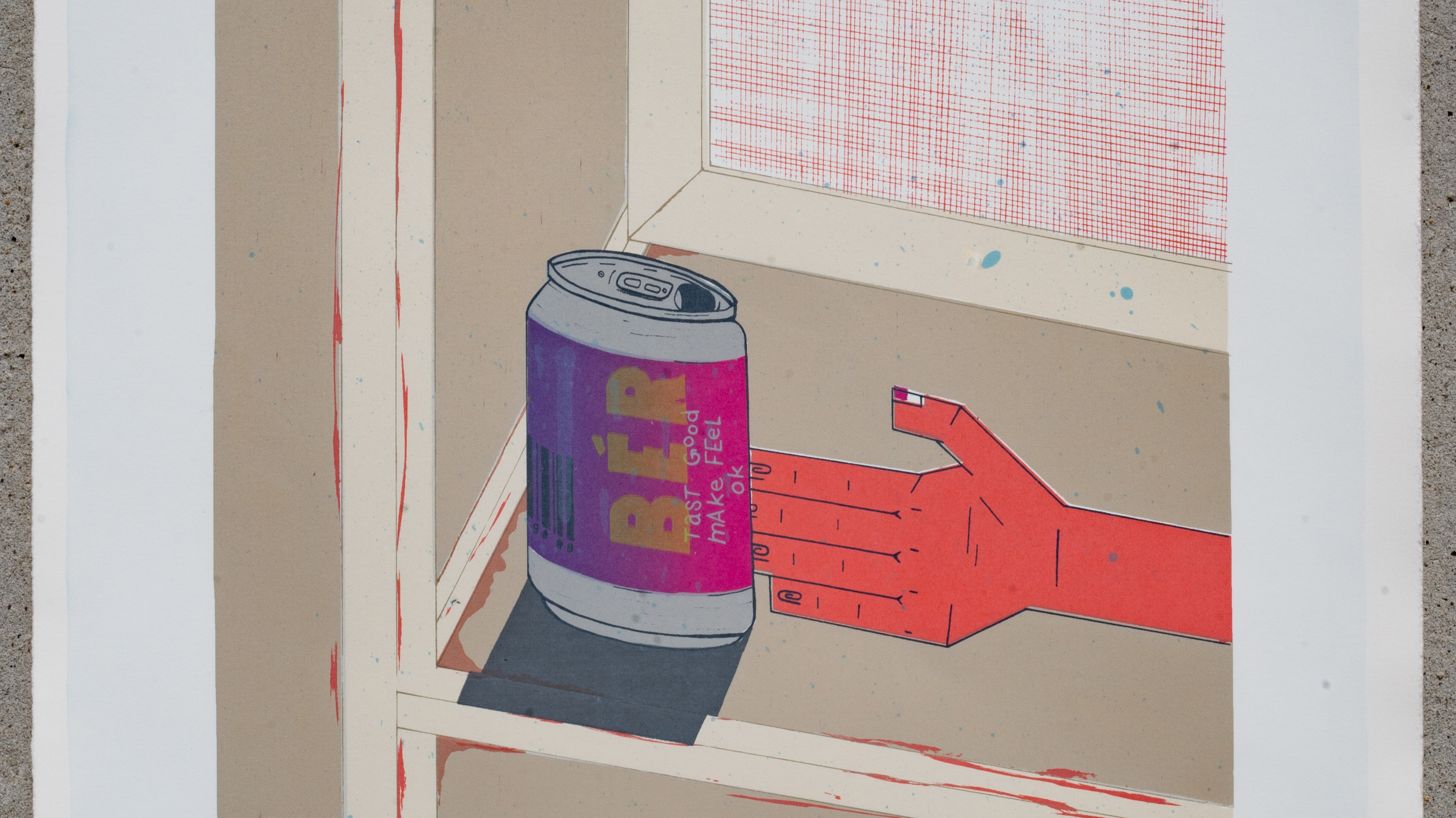
The inspiration for the logo came from this little glass. These classes are used for serving cortado's and they are something special. Really, they're a pretty foundational drink for espresso. Equal parts espresso to steamed milk and a real test to see whether the espresso you have been working so hard dialing in is compatible with milk. Not only this, but the best drink for really practicing if you know how to pour latte art. My 100+ photos of latte art on my phone can attest to the practice and insanity it takes to get a pour right.
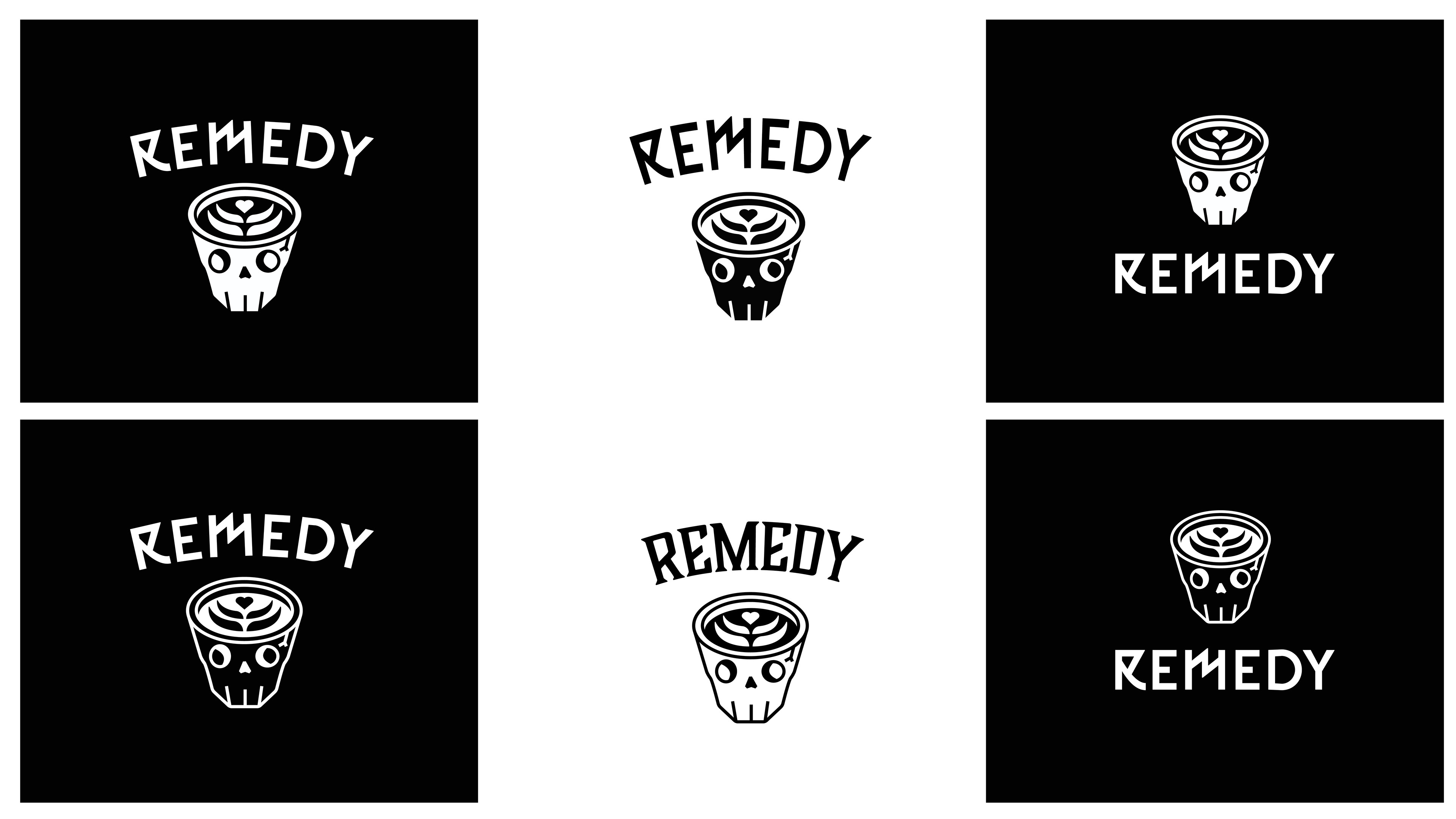
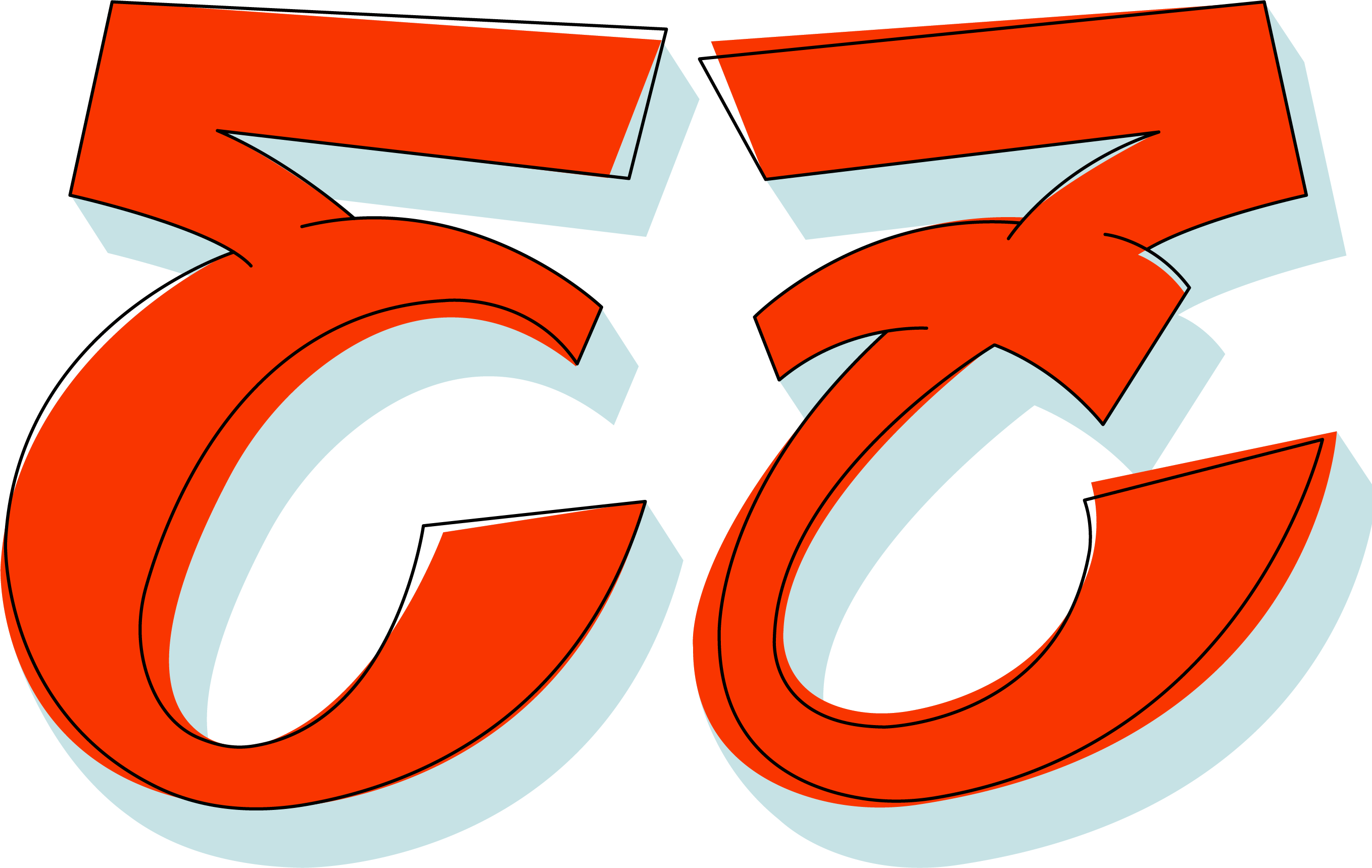
And with that, some of the first iterations of the logo were made. I quickly started sketching the idea for the logo in field notes and then took it to Illustrator. A gibraltar turned into a skull sporting some art as brains. The version I had created was a little too vectorized and could use some more work to feel more in tune with the shop. The idea was there though, and everyone really liked the direction it was headed.

After some time in Procreate, Hayden turned the logo into something that more aligned with the feel of the shop and was incredibly welcoming and fun. This would go on to be the final branding for the shop and would shape the general feel of everything going forward. This branding can be found on clothing, mugs, plates, and all over Remedy's brick-and-mortar location.