During the branding process, the goal was to create something that didn't feel too stuffy and had a welcoming and natural feel. Many of the iterations created were close, but didn't quite capture the fun nature of drinking wine.
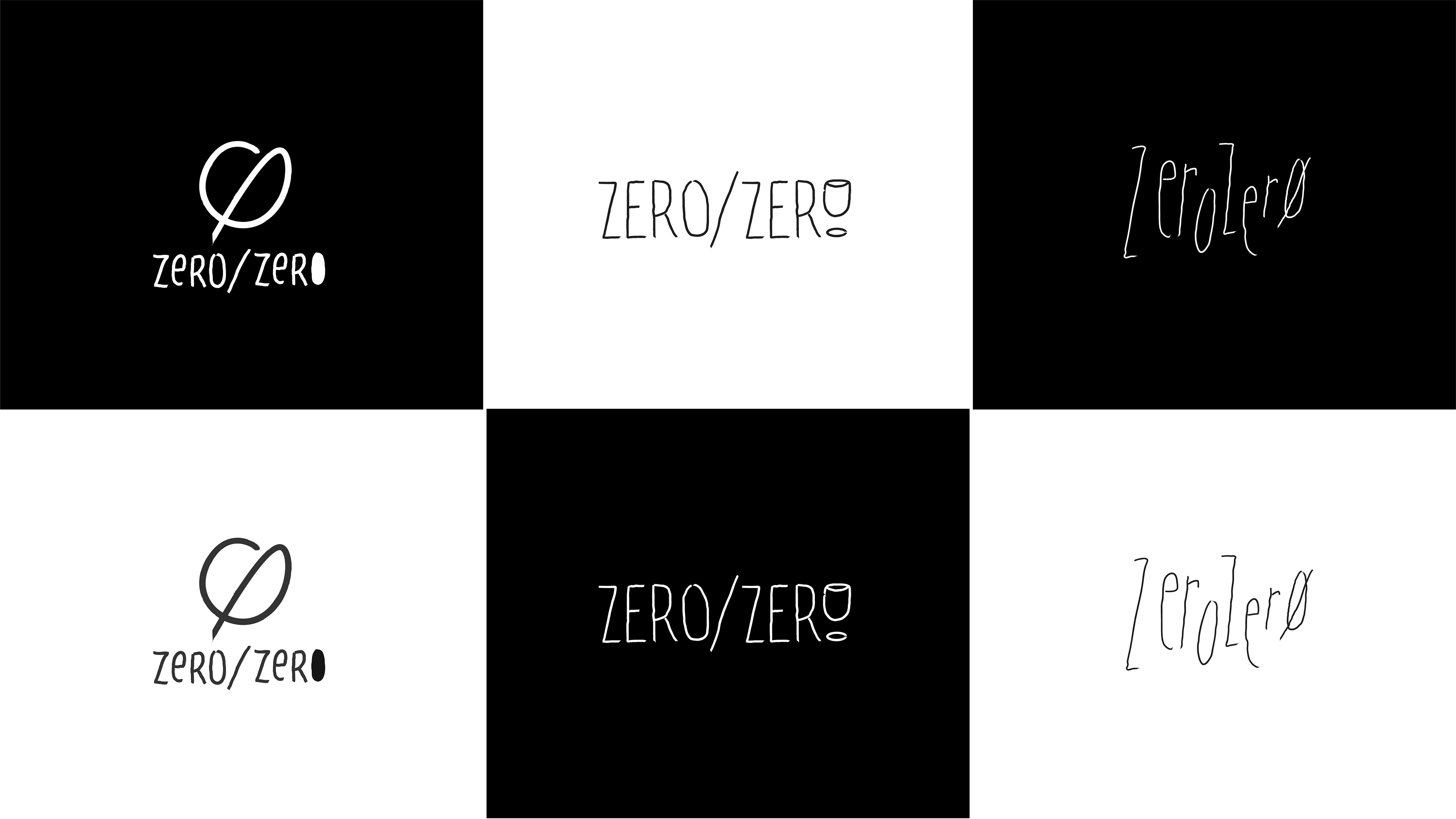
My creative process for this project involved exploring different ways to write and present the brand in a non-serious manner. A lot of options were explored but these were the first three iterations that went through trials. The problem I found with these was that they were either too on the nose or not defining enough that this was a wine bar.
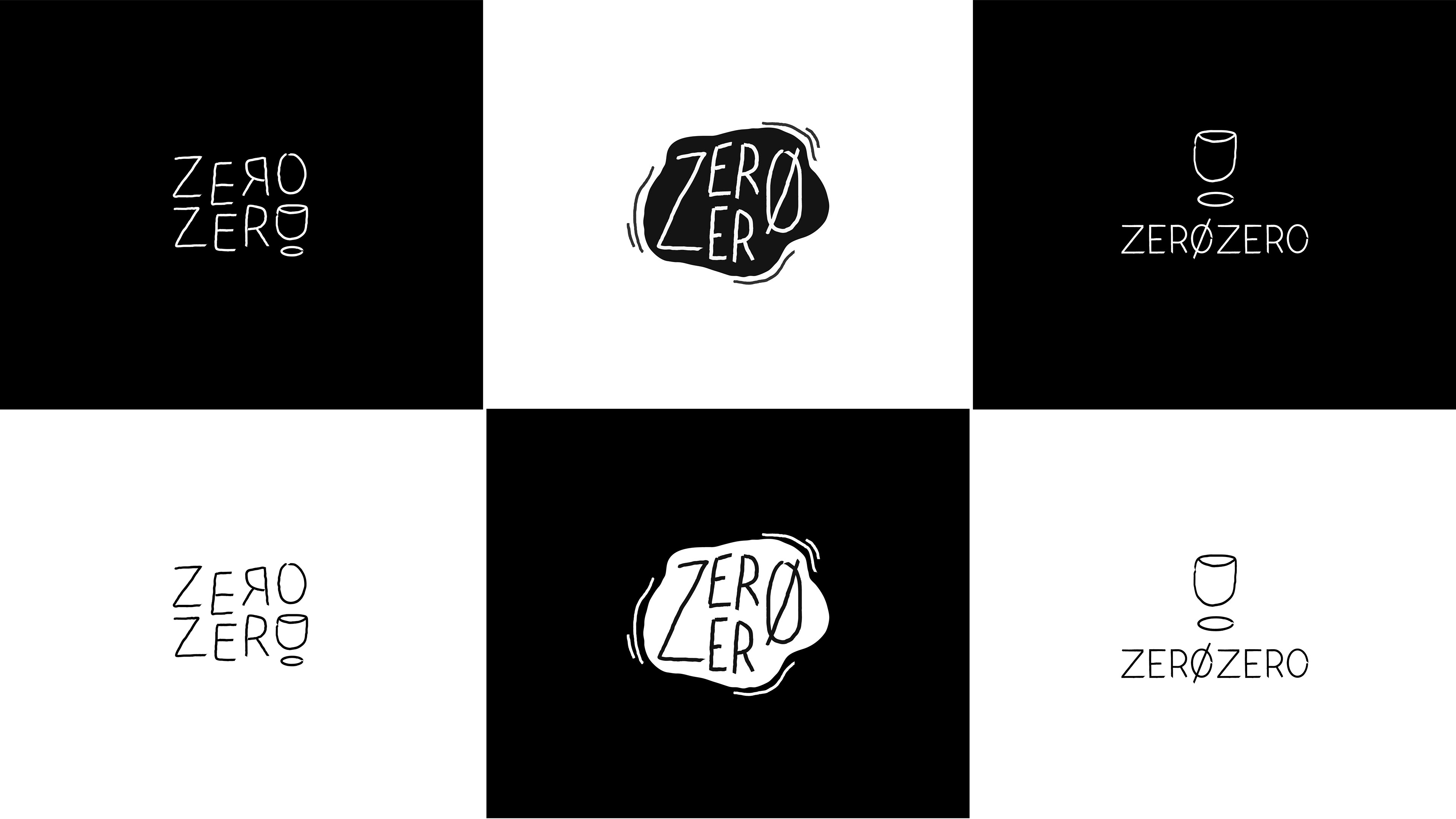
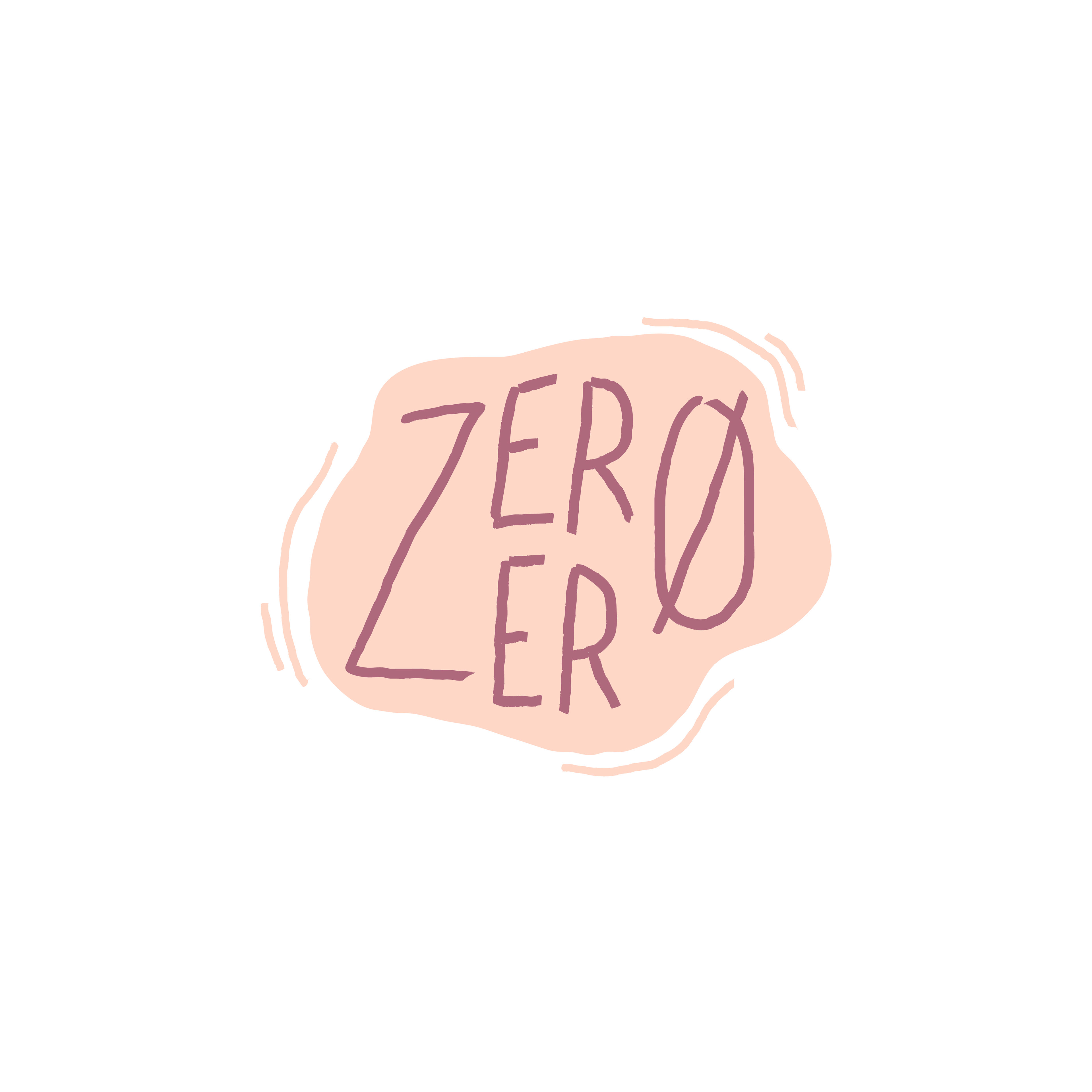
As you can tell, the wine glass was explored quite a few times because using it as a solo mark was at the forefront of my thought process. These examples were just the few that made it to the final rounds but more options were thought out to get to this point. In the end, we picked the spill logo because it captured the not-overly-serious feel while also giving a slight look at what the shop is.
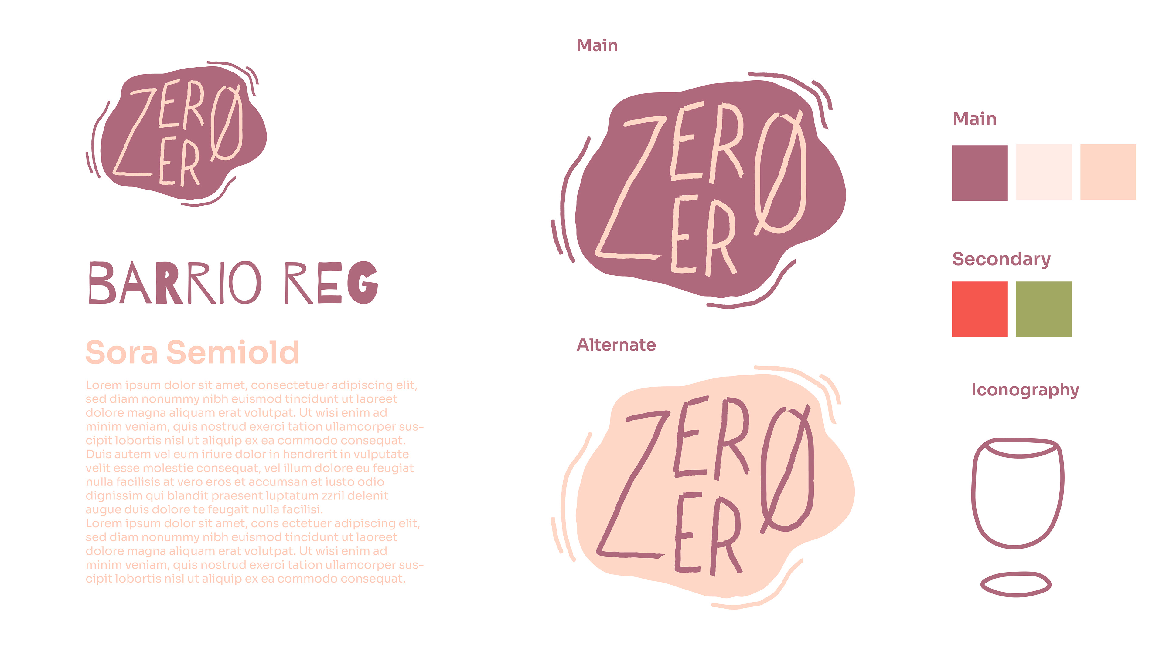
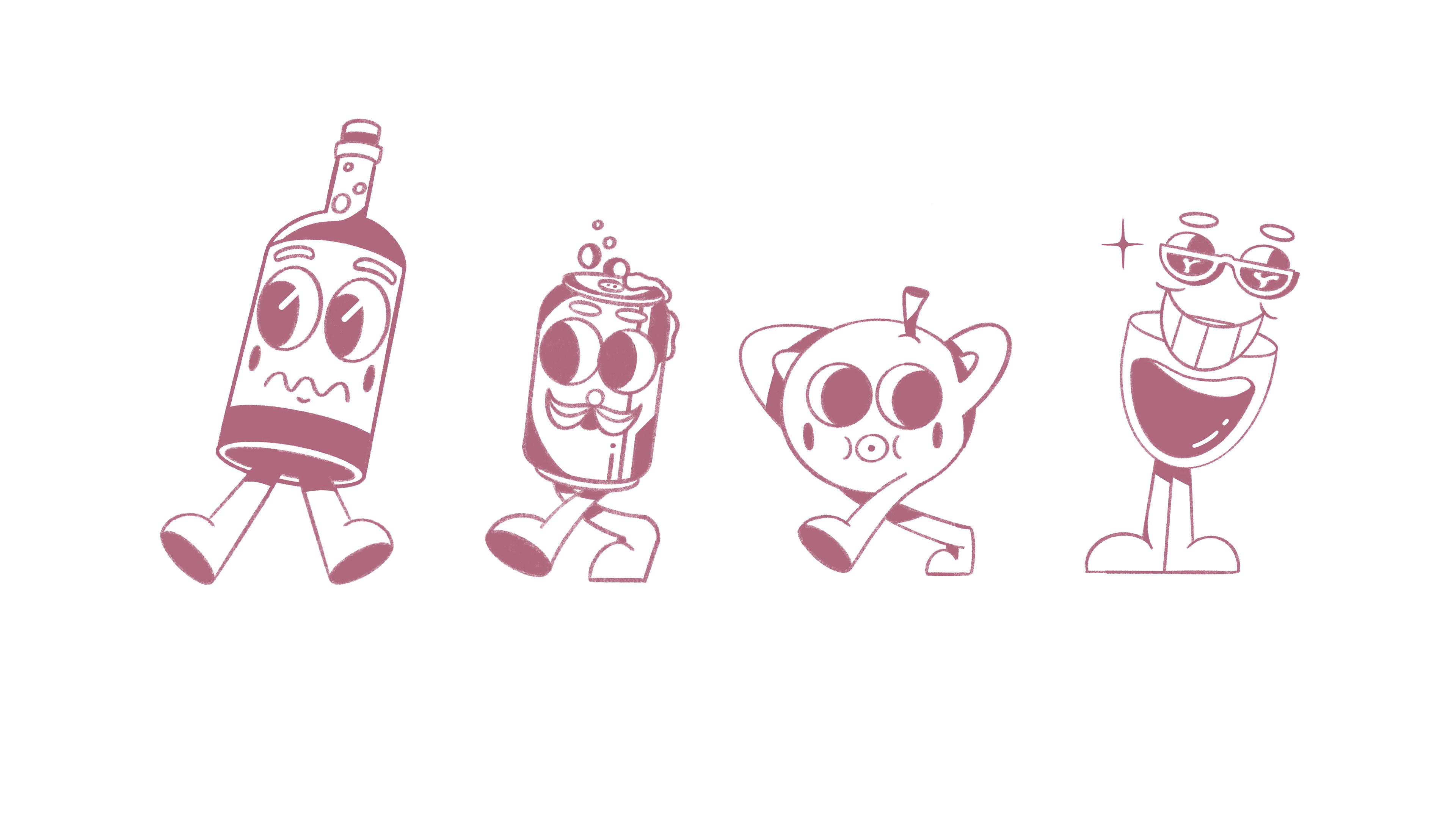
This captured the actual look of wine as well as the fun nature that comes with it. I also illustrated different characters for specialty use featured on the website and the front of the building.
Below are the different features on the outside of the building, including a sign, front window illustrations, and the logo on the front door.
This project posed its problems throughout the process. I found it difficult at first to find something that portrayed exactly what we were going for and how to best use a logo to define this brand. I knew an illustrative approach was the best option since using something too vectorized would not be able to relate to the main focus of this project: natural wine. The idea of natural wine focuses on simple processes and not overly complicating things with technology or modernity. It's going back to the roots of wine-making. I believe we captured these ideas through the logo I created by making something simple, yet unique, and portraying the fun nature of drinking wine.